Old-software testing
Usability testing the existing software with current users.
Refeyn / Macro Mass Photometry / KaritroMP
KaritroMP was a new benchtop instrument for analysing viral vectors and viral-like particles. It was also the chance to design the software properly from the ground up.
When I joined Refeyn, the existing software used lightly customised default QT components. It worked, but looked dated and behaved inconsistently.
KaritroMP created a clean moment to rethink the workflows and lay foundations for the design system the company had been missing.
Usability testing the existing software with current users.
Wireframes for the new software and a clickable prototype.
Usability testing the prototype with target users.
Production UI design across screens and states.
Established components, styles, and documentation in parallel.
Field testing on real instruments with real researchers.
Before designing anything new, I ran moderated sessions with current users on the existing software. The test analysis tracked tasks, success rates, errors, and quotes.
Findings were mapped into an affinity diagram to surface the main pain points and prioritise the workflow issues worth solving first.
I designed wireframes, built a clickable prototype, and tested it with target users. A second affinity map captured what came back from the prototype sessions.
The new software was also the moment to lay the groundwork for Refeyn's design system - extending the brand palette, choosing a typeface, defining components, and documenting it all for engineering. Each hi-fi screen informed the system; the system kept the screens consistent.
That work is a case study of its own.
Read the design system case studyThe hi-fi design focused on four things: making it easy to define an experiment, guiding setup, keeping the user informed and in control, and making complex data intuitive to read.
Authentic experiments, their own samples. I observed end-to-end workflows, measured task success and error frequency, and assessed user confidence through post-task surveys.
Three improvements shipped because of beta.
Alignment Tool
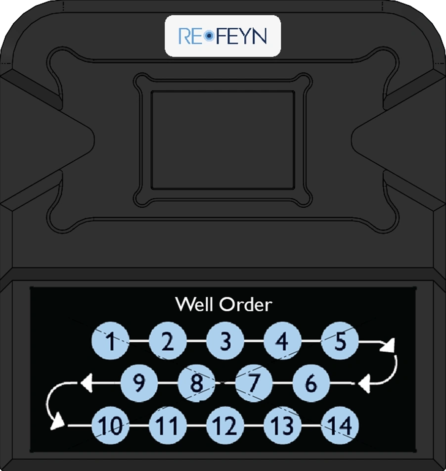
Users got lost while pipetting samples into the wells.
SolutionWith R&D and Marketing, we redesigned the alignment tool to include a well-order diagram printed on it.
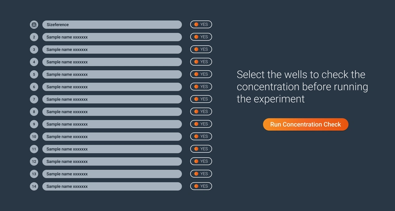
Users struggled to assess whether their sample was at the right concentration before running the experiment.
SolutionWith Software, we added a Concentration Check feature — users select wells to test before committing to the full experiment.
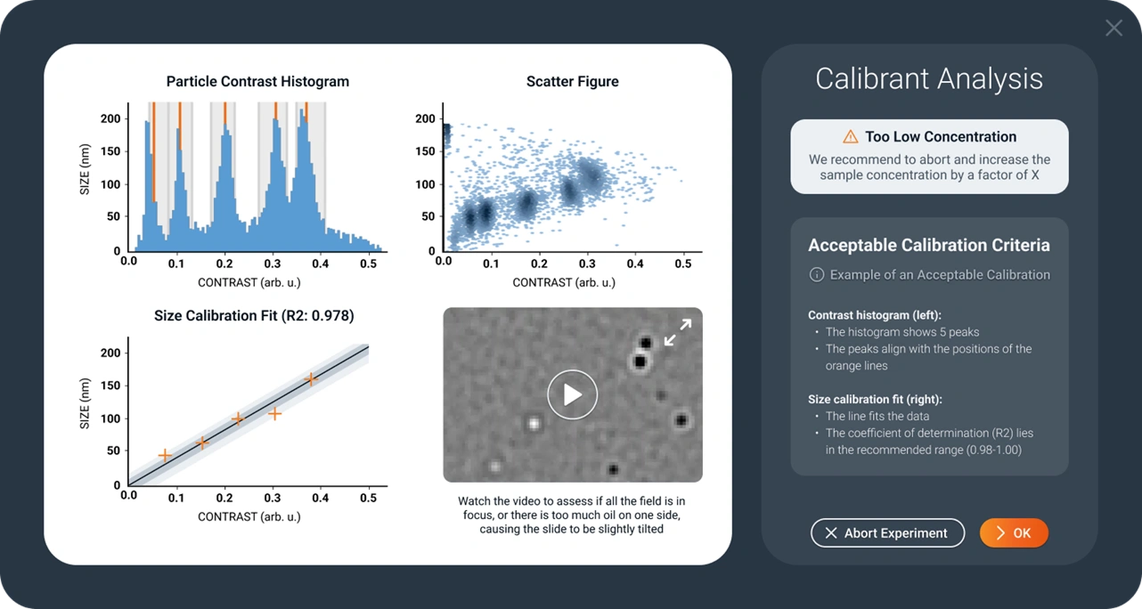
Users struggled to assess whether a calibration was acceptable.
SolutionWe added examples of acceptable and unacceptable calibrations, plus clear criteria to judge against.
After launch, with the Product Manager, I set up a structured feedback system — customer surveys, sales-team input, direct client interviews, and software telemetry — all centralised in Confluence.
The improvement plan prioritised changes by user need. Shipped so far: workspace saving, new graph types, titer calculation.
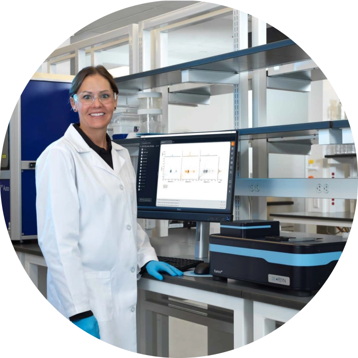
Designing the software in step with the new instrument meant every screen could be tested in real lab conditions, with real samples, before launch. The design system grew alongside it, ready to support the touchscreen products that came next.
OTHER PROJECTS GLIMPSES